


Amid a visually overstimulating digital age, grayscale—or black and white—design stands as both a nod to history and a statement of confident minimalism. From iconic photography to the identities of major brands like Apple and The New York Times, removing color isn’t a limitation, but rather a deliberate, strategic design choice. Grayscale strips away distractions, magnifies contrast, and emphasizes composition, allowing form and function to carry the message. As brands and creators seek clarity in their storytelling and user experiences, grayscale design is undergoing a modern resurgence, proving its enduring power across industries.
The Core Principles of Grayscale in Visual Design
Contrast and Hierarchy: Drawing the Eye to What Matters
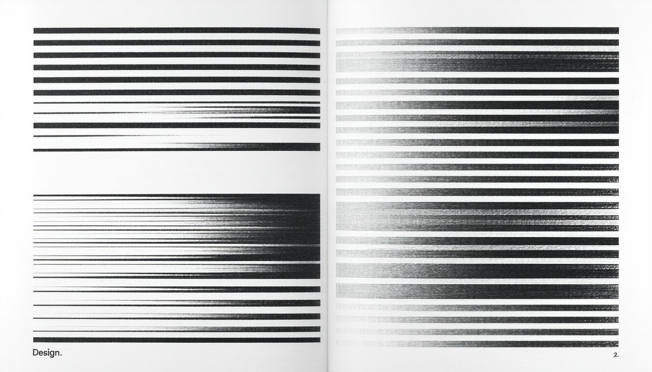
Grayscale design relies heavily on the interplay between black, white, and a spectrum of gray tones. Without the crutch of color, designers must use contrast to direct attention, establish hierarchy, and communicate mood. The stark binary between black and white heightens visual drama, making even the simplest elements stand out.
Typography, imagery, and negative space become fundamental. In black and white photography, for example, the absence of color spotlights light, shadow, and texture, often producing images that feel more intimate and timeless.
Simplicity That Drives Focus
A key advantage of grayscale design is its built-in clarity. By deprioritizing color, layouts naturally feel less cluttered, allowing essential content and calls-to-action to take center stage.
Many luxury brands, such as Chanel and Prada, exploit black and white for its association with sophistication and timelessness—distilling their visuals to communicate trust, heritage, and exclusivity.
"Grayscale forces you to focus on what truly matters—the structure and story—rather than being dazzled by transient color trends," says Paula Scher, a renowned graphic designer. "It’s the ultimate test of design fundamentals."
Emotional Resonance and Brand Identity
While color psychology can sway perception, grayscale creates a universal sense of elegance, seriousness, and authority. Newspapers and premium editorial outlets frequently use black-and-white palettes to convey credibility and intellectuality. At the same time, the lack of color can also evoke nostalgia or highlight the conceptual nature of a message, making grayscale a powerful choice for brands seeking depth over trendiness.
Grayscale in Practice: Industry Examples and Case Studies
Digital Experiences: Modern Websites and Apps
Semantic clarity is a key reason why grayscale is prevalent in tech product design, particularly during wireframing or prototyping phases. Tools like Figma and Adobe XD encourage grayscale layouts to help focus on structure and usability before color decisions enter the process.
Beyond prototyping, several contemporary websites adopt almost-monochrome palettes to achieve clarity and sophistication. Stripe’s documentation portal, for instance, uses a grayscale base interspersed with sparse color highlights, earning high marks for readability and user engagement.
Photography and Editorial Design
World-renowned photojournalists and artists often default to black and white to evoke emotion or strip an image to its essentials. The Magnum Photos archive is filled with celebrated grayscale works that capture complex narratives without the distraction of color, demonstrating how simplicity can foster emotional impact.
Editorial layouts—whether in print or on screen—use grayscale to direct flow and enhance text legibility, particularly when dealing with long-form content or serious subjects.
Branding: Logos and Identity Systems
Logos rendered in black, white, or gray are often the gold standard for versatility. Brands such as Nike, BBC, and Sony ensure their identity remains instantly recognizable in grayscale, a critical test for logo resilience across mediums and backgrounds.
In the fashion world, designers regularly present lookbooks and campaign collateral in grayscale, signaling refinement and ensuring products, not palates, become the hero.
Benefits and Challenges of Grayscale Design
Advantages Beyond Aesthetics
- Accessibility: High-contrast grayscale often results in improved readability for users with color vision deficiencies.
- Timelessness: Unlike color trends, which evolve rapidly, black and white retain perennial appeal and adaptability.
- Production Consistency: Grayscale assets are easier to reproduce faithfully across different devices, print processes, and lighting environments.
Potential Drawbacks and Creative Constraints
However, grayscale can be limiting when not used thoughtfully. Without color, designers must excel in hierarchy, spacing, and typography; otherwise, designs risk appearing flat or uninspired. In retail or consumer goods, over-reliance on grayscale may also reduce emotional energy or inhibit brand differentiation—especially in categories where vibrant competition is the norm.
The Modern Resurgence of Monochrome Aesthetics
Social Media and Digital Trends
Minimalist aesthetics, driven by platforms like Instagram and Pinterest, have fueled a renewed appreciation for black and white visuals. Influencers, photographers, and brands use grayscale filters to cultivate curated feeds that feel cohesive and high-end. Notably, Leica’s monochrome camera series and related hashtags have inspired artists to revisit the visual storytelling and intensity achieved by grayscale compositions.
Accessibility and Sustainability Considerations
As the web accessibility movement grows, more organizations are prioritizing high-contrast, visually clear interfaces—often achievable via grayscale palettes. Additionally, certain grayscale-on-dark backgrounds can demand less energy from OLED screens, supporting device battery life, though savings are relatively modest in most consumer contexts.
Best Practices: Deploying Grayscale in Contemporary Design Work
Start Grayscale, Add Color with Intention
Many experts recommend designing in grayscale first before introducing color. This method ensures structure, contrast, and functionality are defined by default, and any added color truly serves a purpose—whether to highlight, differentiate, or trigger action.
Test Across Mediums and Users
Designs should be validated for both print and digital contexts, ensuring text remains legible and imagery impactful regardless of medium. Importantly, test usability among users with varying visual abilities; grayscale can improve accessibility but must be used with sufficient contrast.
Examples of Effective Grayscale Use
- Fine art galleries: Utilize grayscale for exhibition catalogs to let art take visual priority.
- Startup pitch decks: Avoiding color-laden slides often underscores a company’s core value proposition more effectively.
- UX wireframes: Digital product teams default to grayscale templates to solve layout and interaction before advancing to brand color schemes.
Conclusion: The Enduring Impact of Grayscale
Black and white design endures not because of nostalgia, but due to its unique ability to clarify, elevate, and distill messages in an increasingly noisy world. For practitioners across disciplines—from branding and editorial to web and product design—mastering grayscale is less about restriction and more about crafting intentional, high-impact visual narratives. As trends ebb and flow, grayscale remains a steadfast tool for designers and brands aiming to deliver messages that are both timeless and timely.
FAQs
Why do designers start projects in grayscale?
Working in grayscale allows designers to refine composition, contrast, and hierarchy without the influence of color, ensuring strong structural foundations before color choices are made.
Does grayscale improve accessibility in digital products?
Yes, high-contrast grayscale designs often enhance readability for users with visual impairments, provided there is sufficient distinction between elements.
What types of brands benefit most from black and white design?
Luxury, editorial, and technology brands frequently use grayscale to project sophistication, clarity, and authority, but any brand focused on timelessness or minimalist communication can benefit.
Are there risks to relying solely on grayscale for branding?
Excessive grayscale may lead to a lack of vibrancy or memorability, and it can hinder emotional resonance in categories where color-driven storytelling is expected.
How is grayscale used in photography to convey emotion?
Without color, black and white photography emphasizes light, shadow, and texture, often resulting in images that feel more intimate and emotionally charged.


Leave a comment